Translink · 2022
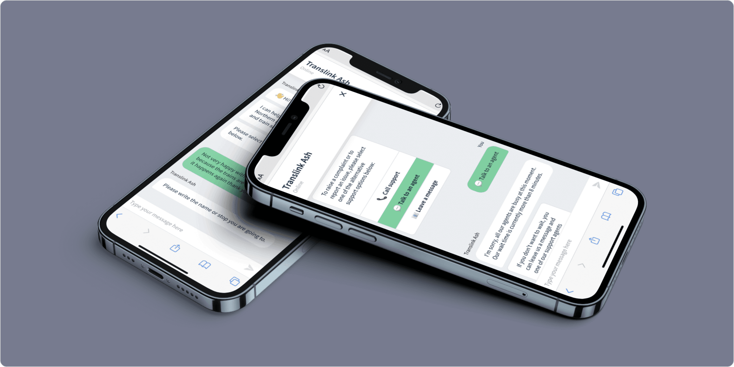
Translink's call centre was overwhelmed by repeat questions from disabled and impaired users. I researched and designed an accessible chatbot. The prototype was not shipped on budget grounds, but the research shaped the voice service Translink launched next, which cut call volume.
Role
Product Designer
Platform
Mobile and web
Team
Worked with a UX design lead, plus stakeholder workshops
Tools
Chatbot.com, Figma, persona workshops
30
chatbots benchmarked
12
real calls analysed
Live
fed a shipped service
Overview
Translink is a public transport corporation in Northern Ireland. Its call centre was overwhelmed by repeat questions from disabled and impaired travellers about step free access, staff support and train times, which strained representatives and pushed up wait times. Working with a UX design lead, I researched and designed an accessible, conversational journey planning experience to give those travellers a genuine self serve option.
The problem
Disabled and impaired users were calling Translink for the same things over and over: accessibility features, staff support, schedules. That strained representatives and pushed up wait times. They needed a clear, accessible self serve option that did not assume how a user reads, scrolls or remembers.
Goals
- 01Give impaired and able bodied travellers an equitable, stress free way to plan journeys.
- 02Take pressure off the call centre by answering the questions people actually phone in with.
- 03Design to real accessibility needs from the first screen, aligned to WCAG.
What the research told me
25 to 30
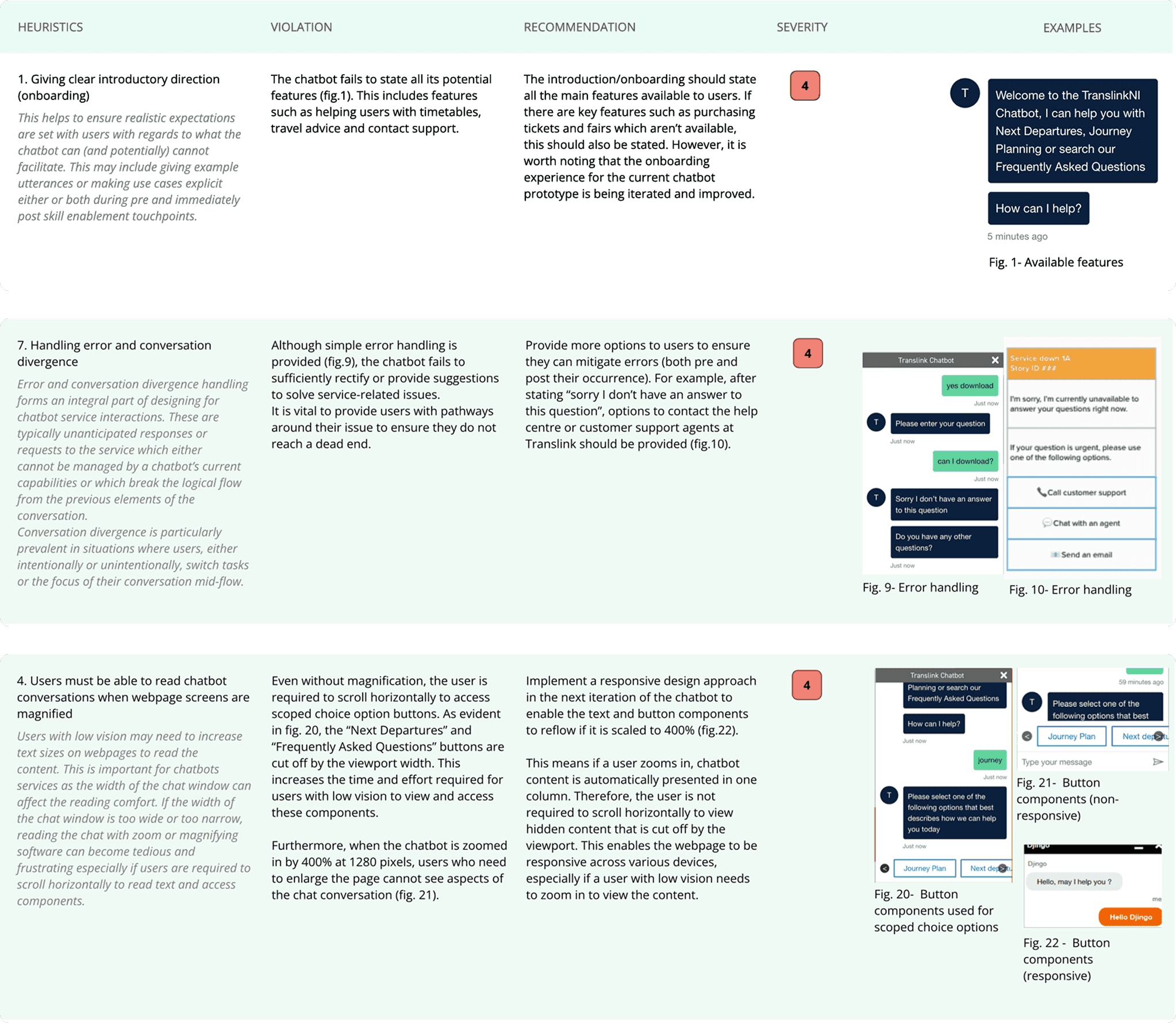
chatbot apps benchmarked with heuristic evaluation. The same gaps recurred: bots rarely say what they can do, dead end when misunderstood, and break when text is zoomed.
12
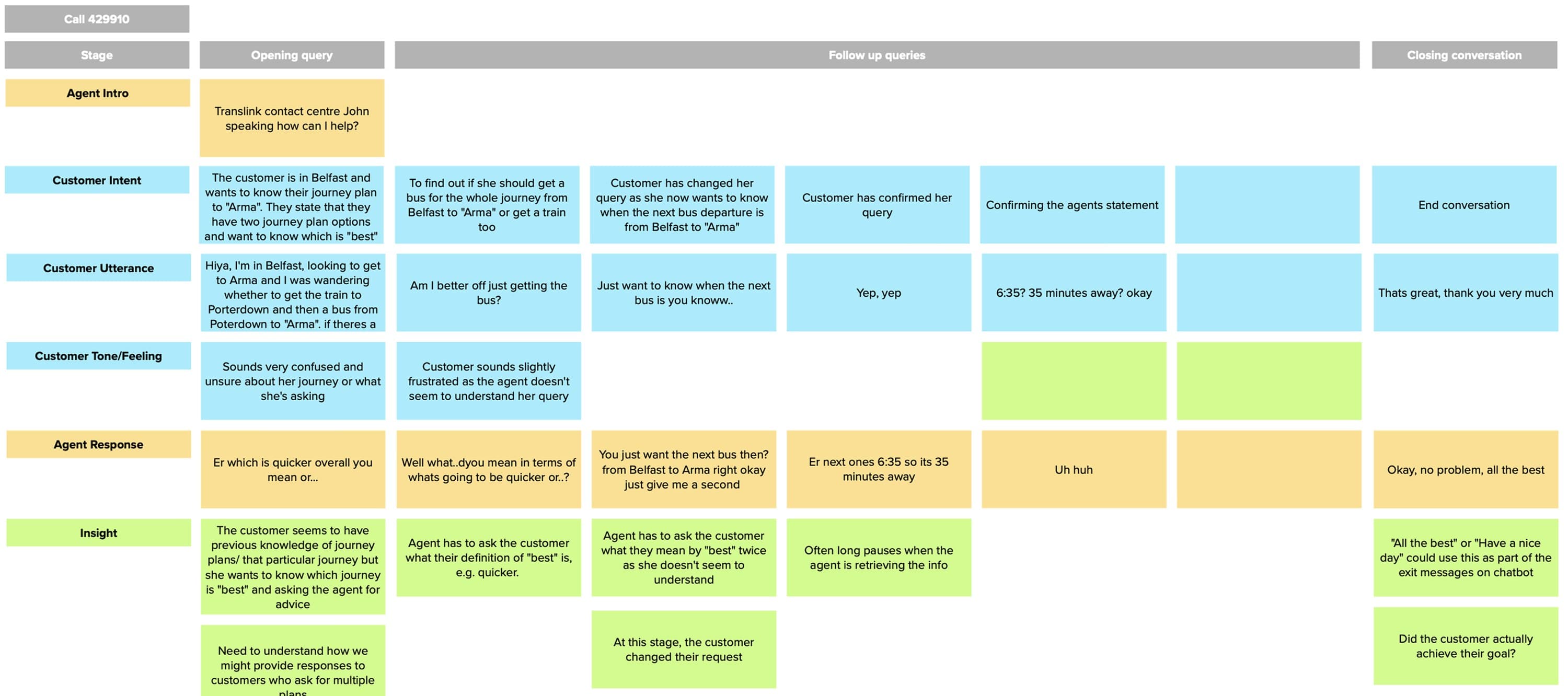
real call centre recordings analysed, plus a persona workshop, so the chatbot answered the questions people actually had rather than the ones we assumed.
Testing with six people with mixed cognitive and visual needs showed onboarding had to state capabilities up front, and journey details had to stay visible, not buried in the thread.
Key decisions
Benchmarked widely
I ran heuristic evaluations against 25 to 30 chatbot apps, scoring each for onboarding, error handling and responsive behaviour. The same gaps showed up everywhere: chatbots rarely tell you what they can actually do, they dead end when they misunderstand you, and they break when the text is zoomed.
Grounded it in real conversations
A persona workshop with stakeholders mapped the different users and how each one relied on the service. I then analysed 12 real call centre recordings to shape the chatbot's structure and tone, so it answered the questions people actually phoned in with, not the ones we assumed.
Tested with real needs
Six participants with mixed cognitive and visual needs tested the prototype. Three findings drove the redesign: onboarding had to state the chatbot's features up front, people needed reassurance and clarity on departure and arrival times, and difficulty recalling journey details made them fall back on other aids. So I made onboarding spell out what it could do, kept journey information visible instead of buried in the thread, and built a layout that did not force horizontal scrolling even at 400% zoom.
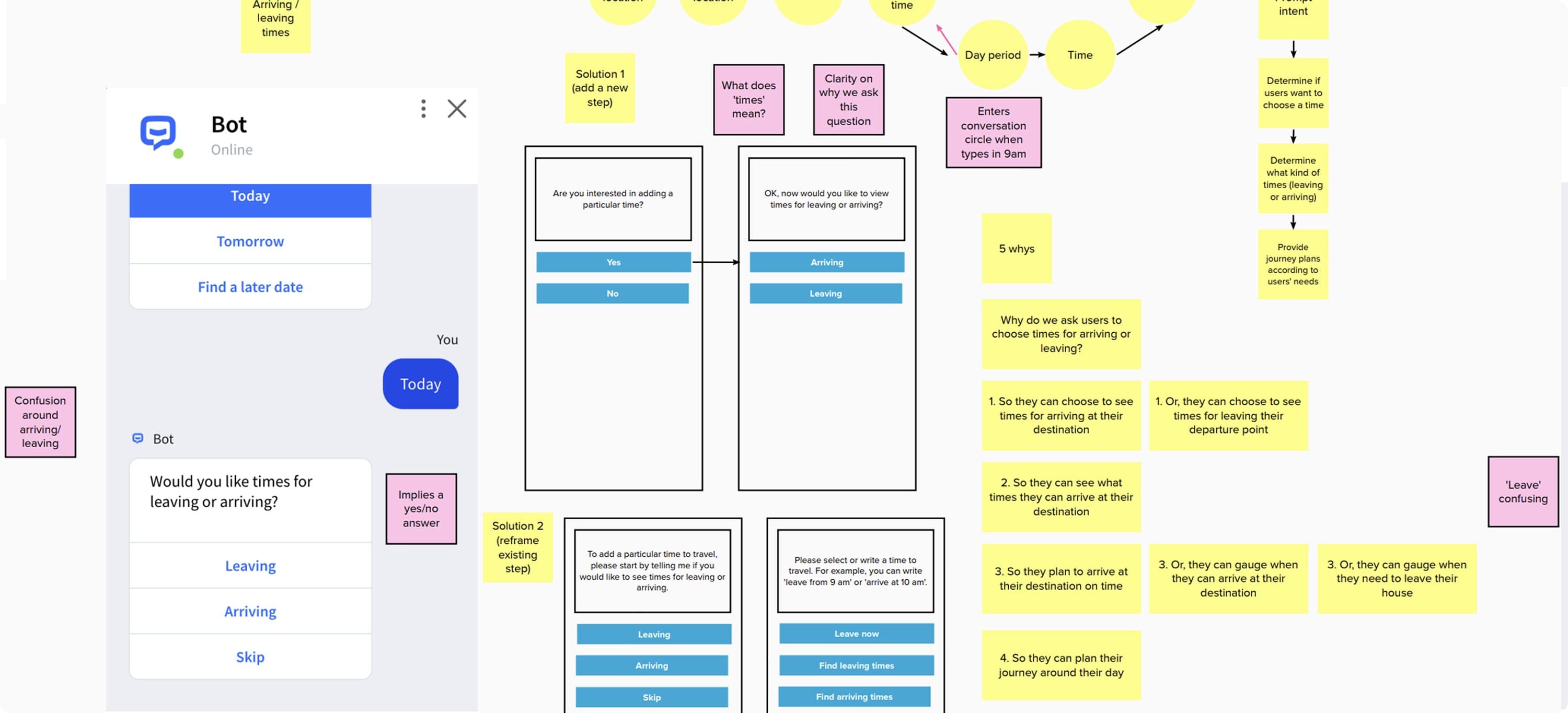
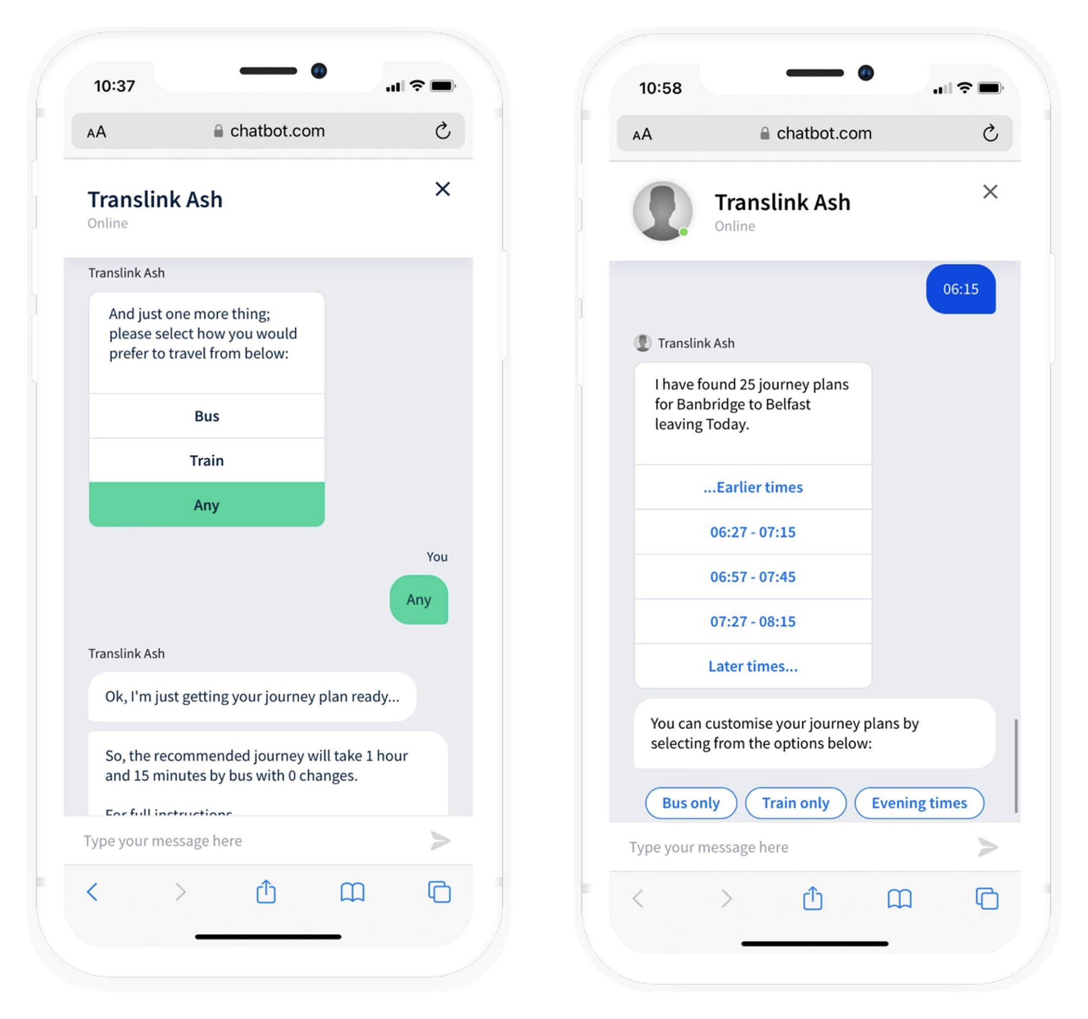
From ideation to prototype: working through the 'leaving or arriving' confusion and reframing the steps, then the accessible chat flow I built, with capabilities stated up front and journey details kept visible.
The outcome
The prototype did not ship because of budget, but the research fed directly into the voice service Translink rolled out next, which reduced call centre queries. Foundational research moved the product even when the first deliverable did not launch.
What I would do differently
Accessibility cannot be a layer you add at the end. Building for cognitive and visual needs from the first screen changed the structure of the whole flow, not just its styling.