Film Finder · 2024 to present
Film Finder's early users could not find films that matched their actual taste, only their genre. I redesigned discovery and onboarding and shipped front-end code myself. Weekly active users grew from around 20 to 169 and the newsletter reached 2,000 subscribers.
Role
Co-founder · Design and code
Platform
iOS and Android
Team
Co-founder leading design and shipping code, alongside a developer and a product manager.
Tools
Figma, Figma MCP, Claude, React Native, Typeform, Miro
169
weekly active users, up from 20
2,000
Substack subscribers
iOS + Android
live in both stores
Overview
Film Finder is a startup I co-founded to help people find something worth watching faster. Its whole promise is to find films at lightning speed, but the early product was not living up to it. The homepage and onboarding created unnecessary cognitive load and slow decision making, which drove high drop off and churn right after signup. Working with a developer and a product manager, my role blended product design and design engineering. I ran the research, built the prototypes, and shipped UI changes directly in the app using AI-assisted coding.
The problem
Genre filtering was too blunt. Someone who loves Parasite and Get Out does not want "horror and thriller", they want a specific tone and intelligence that tags cannot capture. The homepage was a generic feed, and onboarding was a wall of posters that created noise and drop off straight after signup.
Goals
- 01Help people decide what to watch quickly, and feel confident in the choice.
- 02Cut the cognitive load in onboarding so capturing taste feels lightweight, not like work.
- 03Test whether social discovery could add value without diluting the core job of finding a film.
What the research told me
65%
response rate across 22 participants in interviews and Typeform concept testing. The clearest theme: people do not want more options, they want better guidance.
Long lists and poster-heavy onboarding made decisions feel heavier, not easier. Cognitive load at first run was the real source of drop off.
On social, people cared about shared taste and context far more than generic following. That reframed social as support for discovery, not a competing feature.
Key decisions
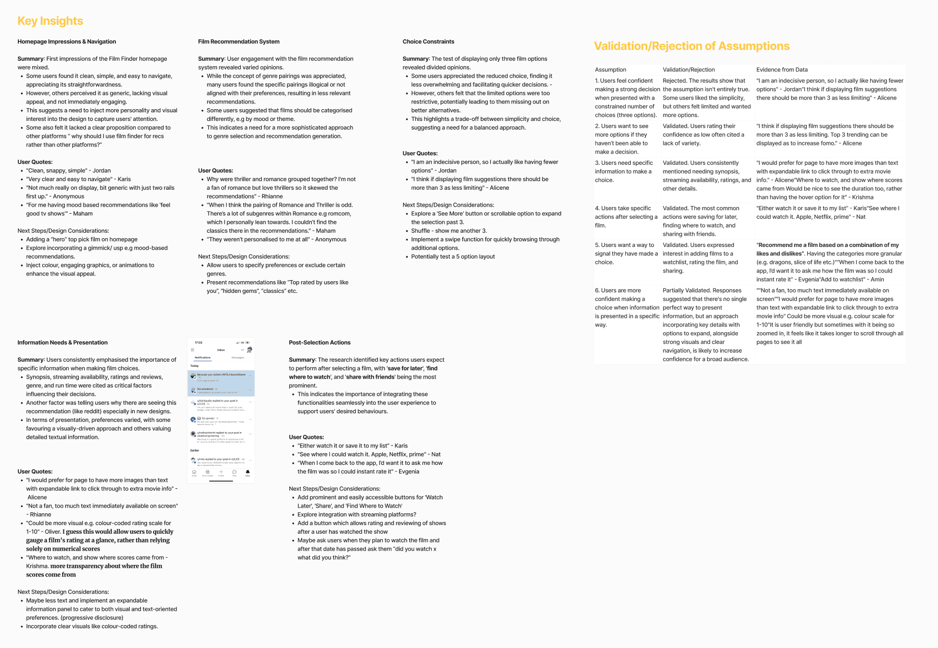
Talked to the people who were leaving
I ran 12 interviews with early users, 22 in total at a 65% response rate, paired with Typeform concept tests with existing users. One pattern came up again and again: people do not want more options, they want better guidance.
Prioritised by impact and effort
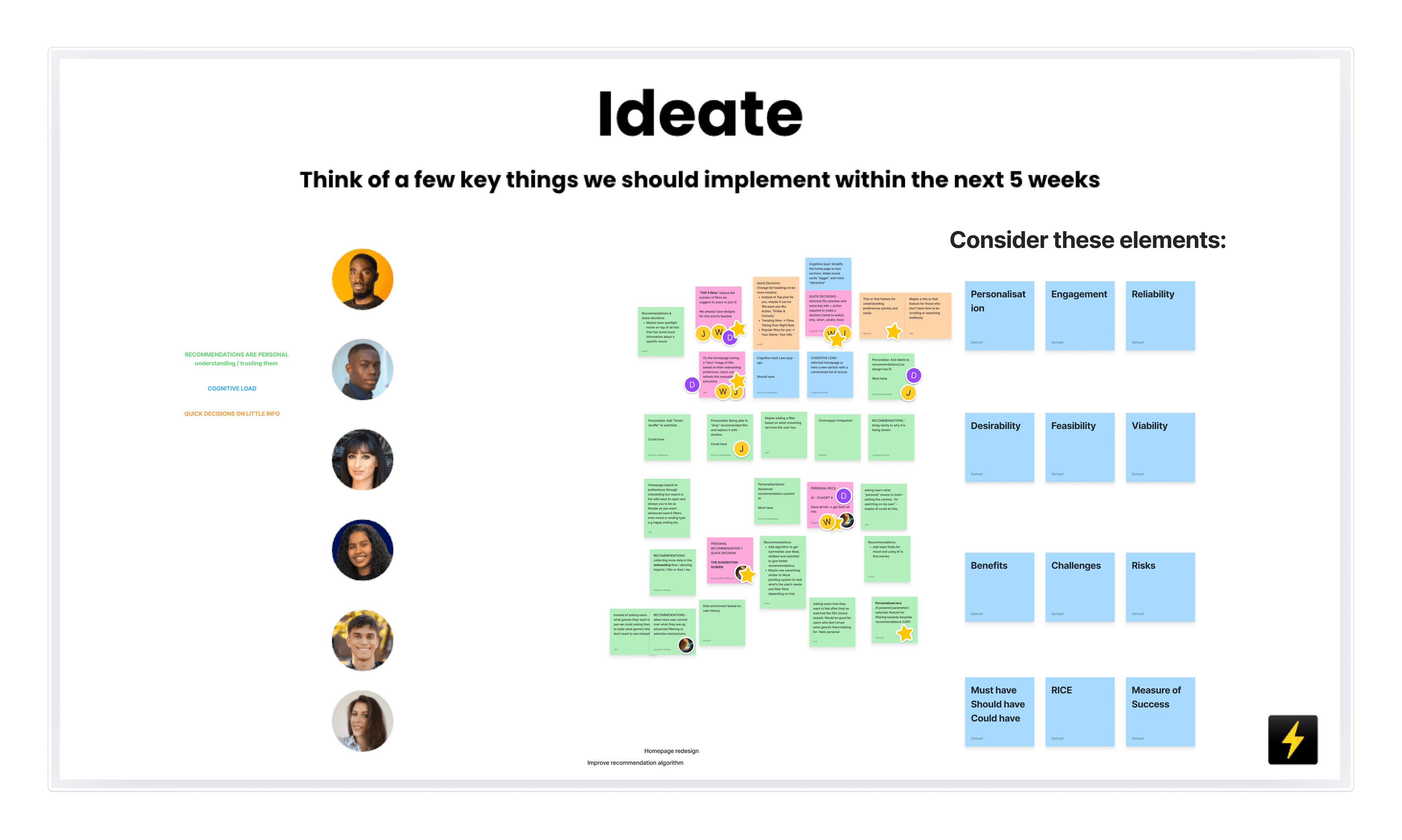
We had more ideas than a small team could build: mood-based recommendations, AI-driven recs, and personalisation from viewing history or explicit preferences. In a team workshop we weighed each one against impact, effort and feasibility, using lenses like RICE and MoSCoW, then committed to the high-impact, low-effort work first. That is why we shipped the Top 3 home, simpler onboarding and Shuffle before the bigger AI features. With a small team, backing the fast wins was how the redesign actually shipped and moved the numbers.
Cut choice with a Top 3 For You home
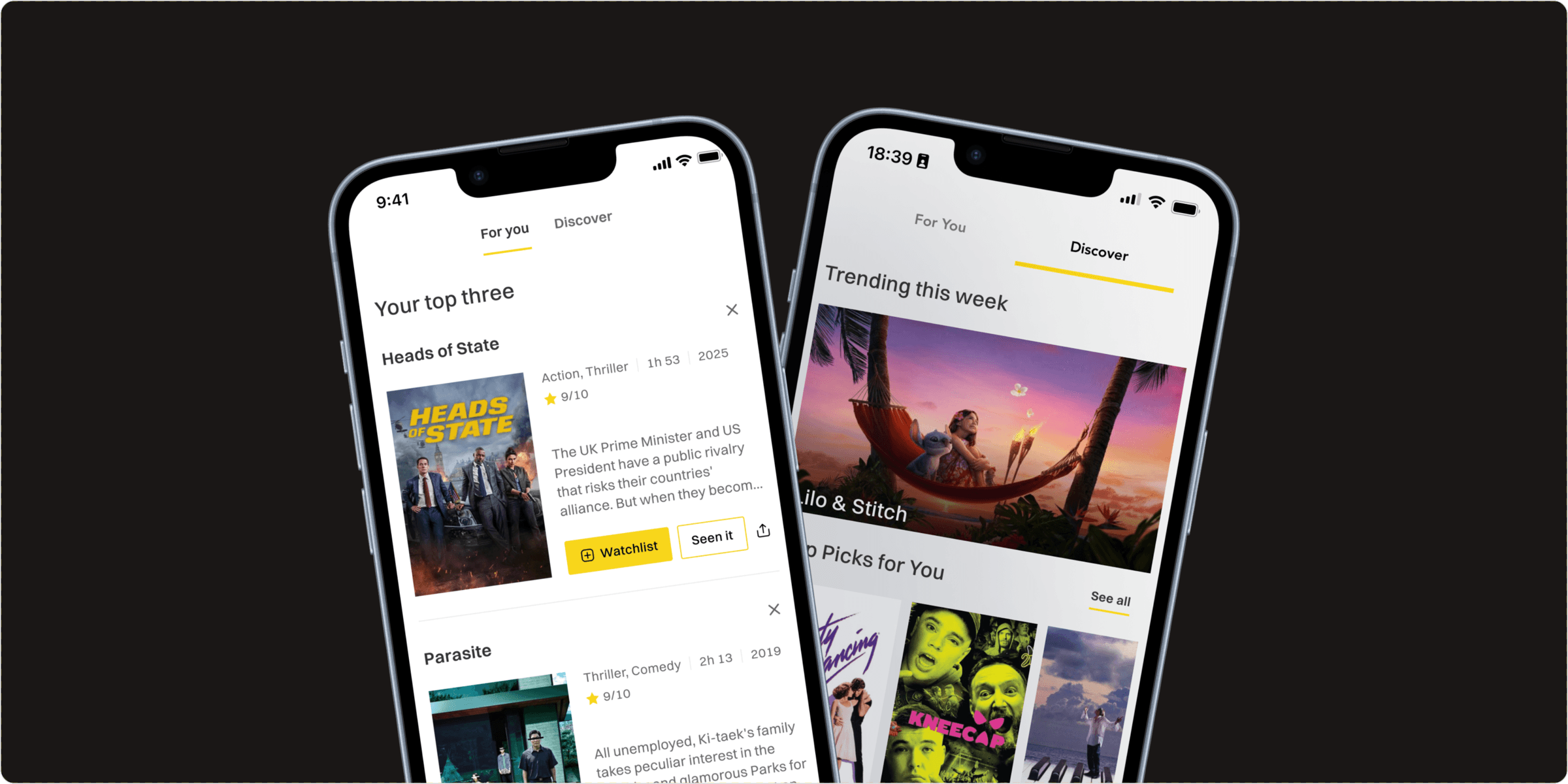
I replaced the generic feed with a constrained "Top 3 For You" model for fast decisions, and moved deeper browsing into a separate Discover tab so the two jobs stopped fighting each other. Showing only three felt risky, but in testing it did the opposite of what I feared: fewer options raised confidence instead of frustration.
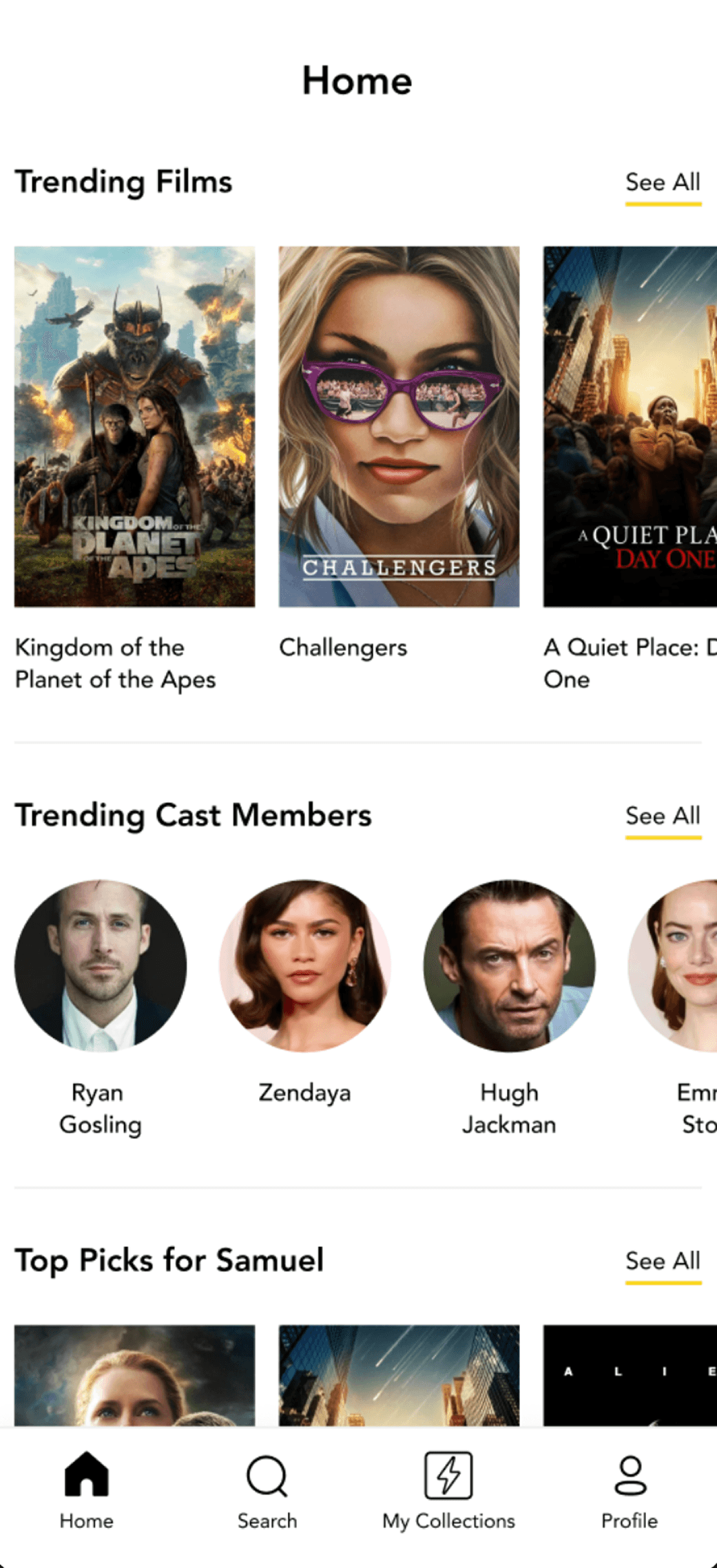
Before: the old, generic homepage feed. After: the new Top 3 For You home (a screen recording of the prototype).
Simplified onboarding to genre chips
Genre selection went from poster heavy screens to compact chips that are faster to scan and complete. Onboarding dropped from seven steps to three, which cut the visual noise and made capturing taste feel lightweight rather than effortful.
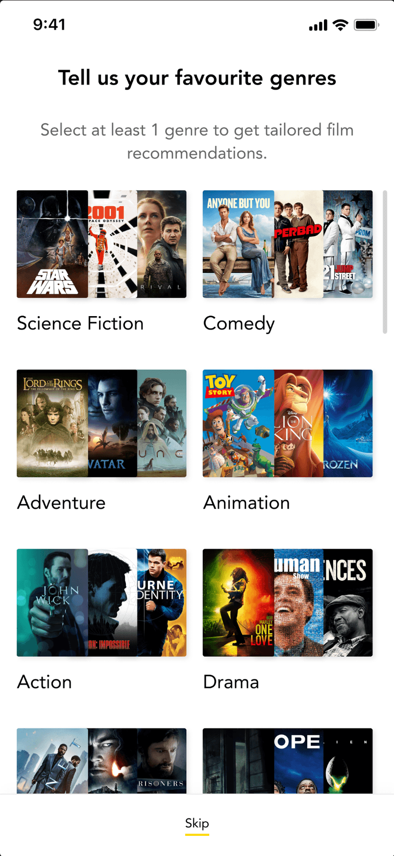
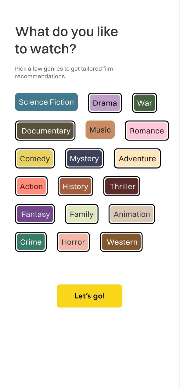
Before: the poster-heavy genre picker. After: compact, colour-coded chips. Onboarding dropped from seven steps to three.
Made discovery feel effortless with Shuffle
As category lists grew, scrolling felt like work rather than exploration. I redesigned category pages around fewer, larger posters and added a Shuffle action: one tap generates a fresh set of films. A lightweight dice micro-interaction makes it feel playful and intentional, and I tested it with our community over WhatsApp before shipping.
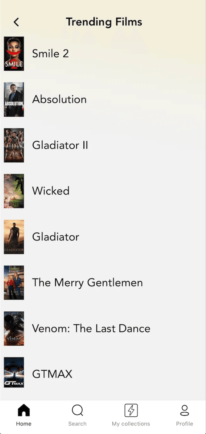
Before: a long, text-heavy list to scroll through. After: fewer, larger posters with a one-tap Shuffle that generates a fresh set of films.
Explored social as a discovery aid, not a feed
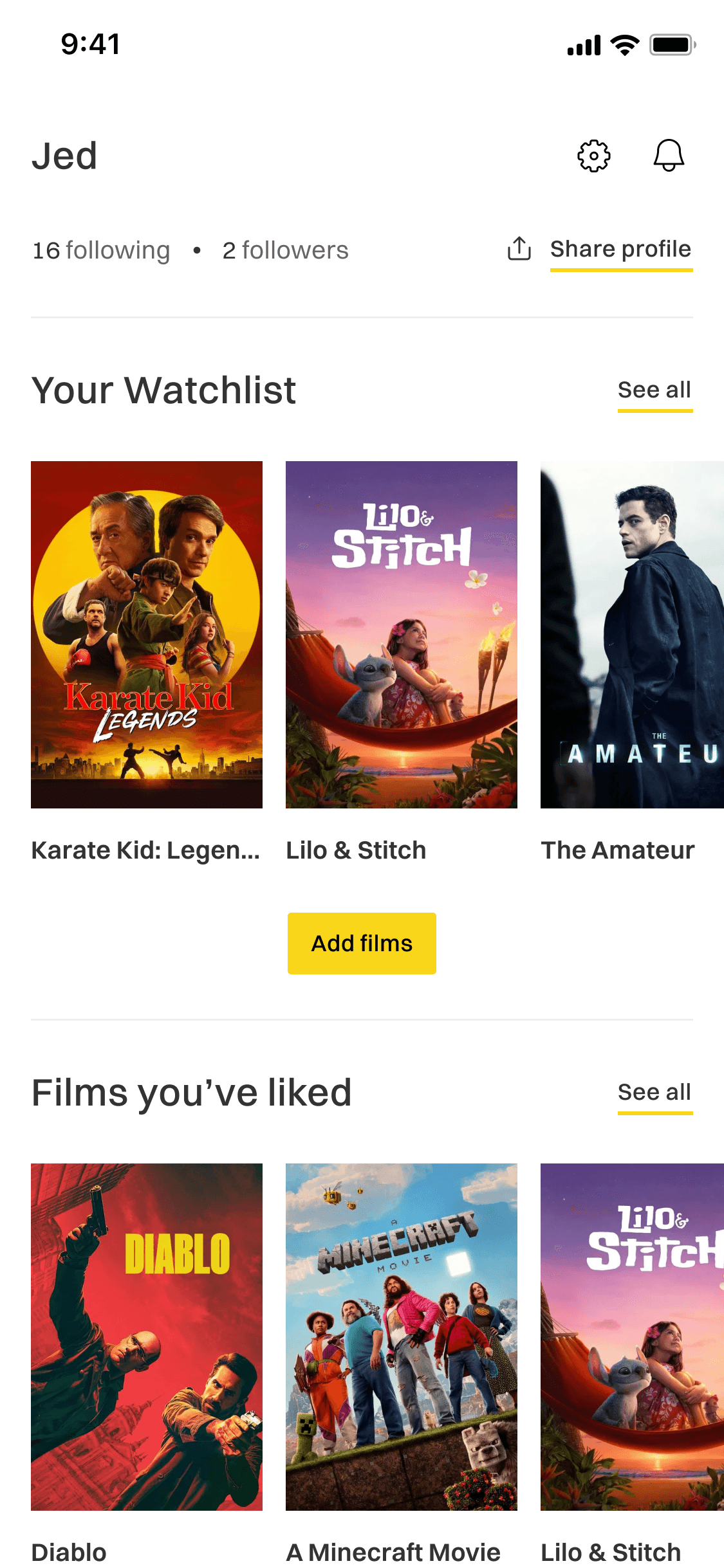
Rather than bolt on generic following, I designed profiles around film identity: what someone has watched, liked, or wants to watch, with shared taste at the centre. Treating social as a way to strengthen recommendations rather than compete with them kept the core decision fast while opening a credible path to stickiness.
Built a component library and shipped in code
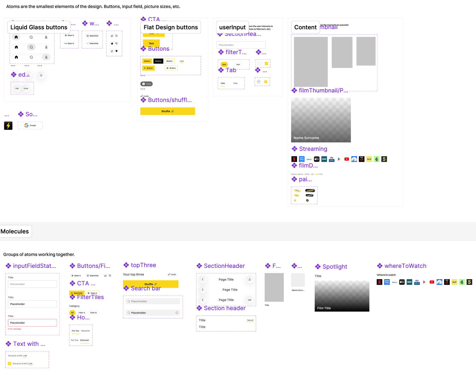
I built the component library in Figma covering recommendation cards, film detail cards, genre chips and navigation states, then wrote production React Native alongside my co-founder. For small UI changes I used Figma MCP and Claude to prototype and ship directly, keeping engineering time on higher-impact work.
The outcome
Weekly active users grew from around 20 to 169 a week after the redesign, and the Substack newsletter reached 2,000 subscribers, part of a wider community of over 7,000 across our socials, newsletter and the monthly film club we run. The taste anchored recommendation model became the core of how we position the product, and we are now rolling it out in a modern liquid-glass style with a matching marketing site.
Backed by
Film Finder has been supported by an accelerator, mentors and industry partners as we have grown.

Barclays
Funding through their accelerator programme
Sky
Leadership and mentorship

Everyman
Partner for our monthly film clubs

University of Southampton
Internship partnership
What I would do differently
First session experience drives retention more than feature depth. Reducing choice at the right moments raised confidence rather than frustration, and the growth came once we finally simplified onboarding. I would have done that six months earlier.