Film Finder · 2024 to present
Identity, design system and product brand for a film-discovery app that stops decision fatigue. One bolt, one yellow, one voice, built to hold from the App Store icon to a printed shirt.
Role
Co-founder and Chief Design Officer
Platform
Product, web, merch, social
Team
Built with my co-founders Samuel (CEO) and Waed (CTO). I led brand and design.
Tools
Figma, Illustrator, Blender
169
weekly active users, up from 20
2,000+
Substack followers
Live
on the App Store worldwide
Overview
The films are there. The deciding is the problem. Streaming fragmented the way we watch: couples burn 45 minutes scrolling before anyone presses play, and groups end up with something no one actually wanted. Analysis paralysis is the enemy of movie night. Film Finder exists to compress the gap between intention and watching, and my job was to build the brand that makes that promise feel real.
The problem
The product had a sharp promise, find films at lightning speed, but no identity carrying it. Every brand in the category hides in the same muted, cinematic dark, so blending in meant disappearing. The identity had to feel as fast and decisive as the product, and hold up everywhere from an App Store icon to a t-shirt.
Goals
- 01Shorten a 45 minute decision so it feels closer to 45 seconds.
- 02Refuse the dark, cinematic category look and stand out on sight.
- 03Build one system tight enough to run from the logo to the copy to the merch.
Key decisions
Ran the whole brand on three words
Speed, taste, decisiveness. Every decision, from the logo to the copy to the Shuffle animation, gets measured against them. An identity has to be loud enough to refuse what the category assumes.

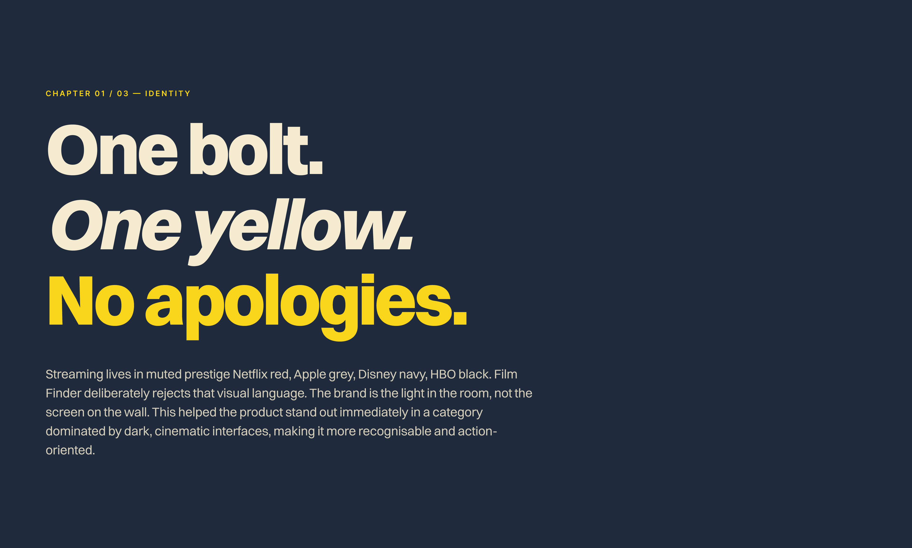
One bolt. One yellow. No apologies.
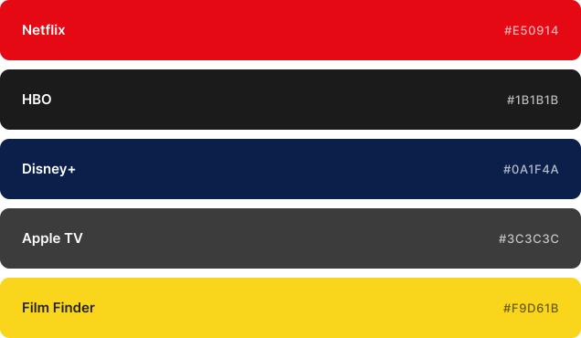
Streaming lives in muted prestige. Film Finder deliberately rejects that visual language. The brand is the light in the room, not the screen on the wall, so it stands out instantly in a feed of black thumbnails.
Why yellow, why a bolt
Film Finder had to look like the app you open when the TV has already failed you. Yellow is urgency: cabs, caution tape, warnings. The bolt is kinetic, a little arcade, a little hazard symbol, sitting outside the premium cinema language the category owns. Closer to a Nintendo cartridge or a Nike kit than a streamer.
One mark, many surfaces
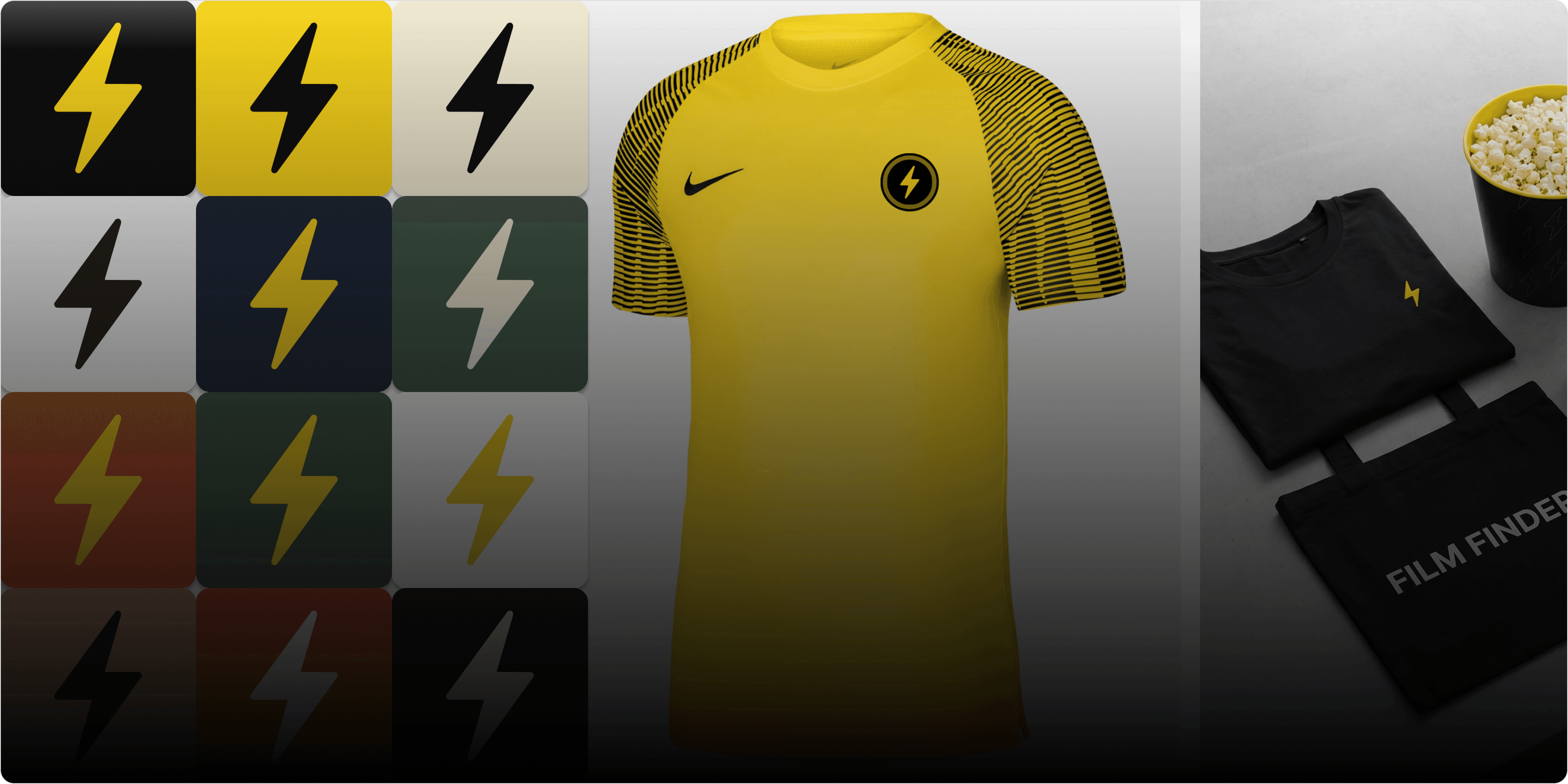
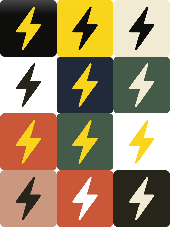
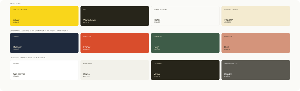
The bolt is the constant. Its form never changes, but the background adapts to context: black gradient for the default iOS icon, solid yellow for brand moments, darker tones for editorial. One rule keeps it sharp: yellow is never tinted, it is #F9D61B or nothing.
Named colour by job, not by hue
Yellow signals action, warm ink carries text. Tokens are named by function, so when a surface changes role the system follows instead of breaking, and there is always a colour combination ready.
One type family, every surface
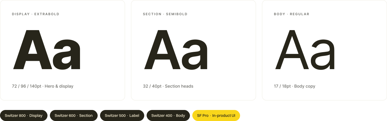
Switzer runs across display, marketing and product, with SF Pro for in-product UI. Weight and size create hierarchy while the typeface stays constant, so the brand reads clearly from App Store banners down to the smallest caption.
Gave it a voice: fast, direct, unapologetic
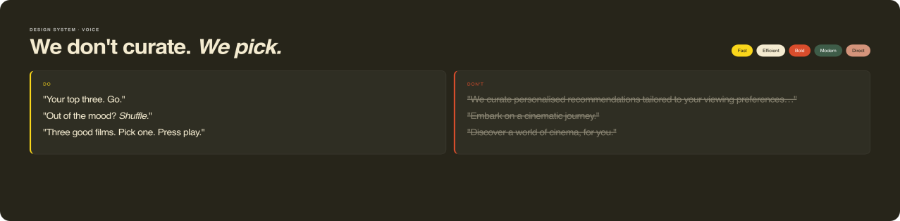
The copy never narrates or over-explains, which keeps the product feeling quick. We don't curate, we pick. The same voice runs from the App Store listing to the newsletter.
In product
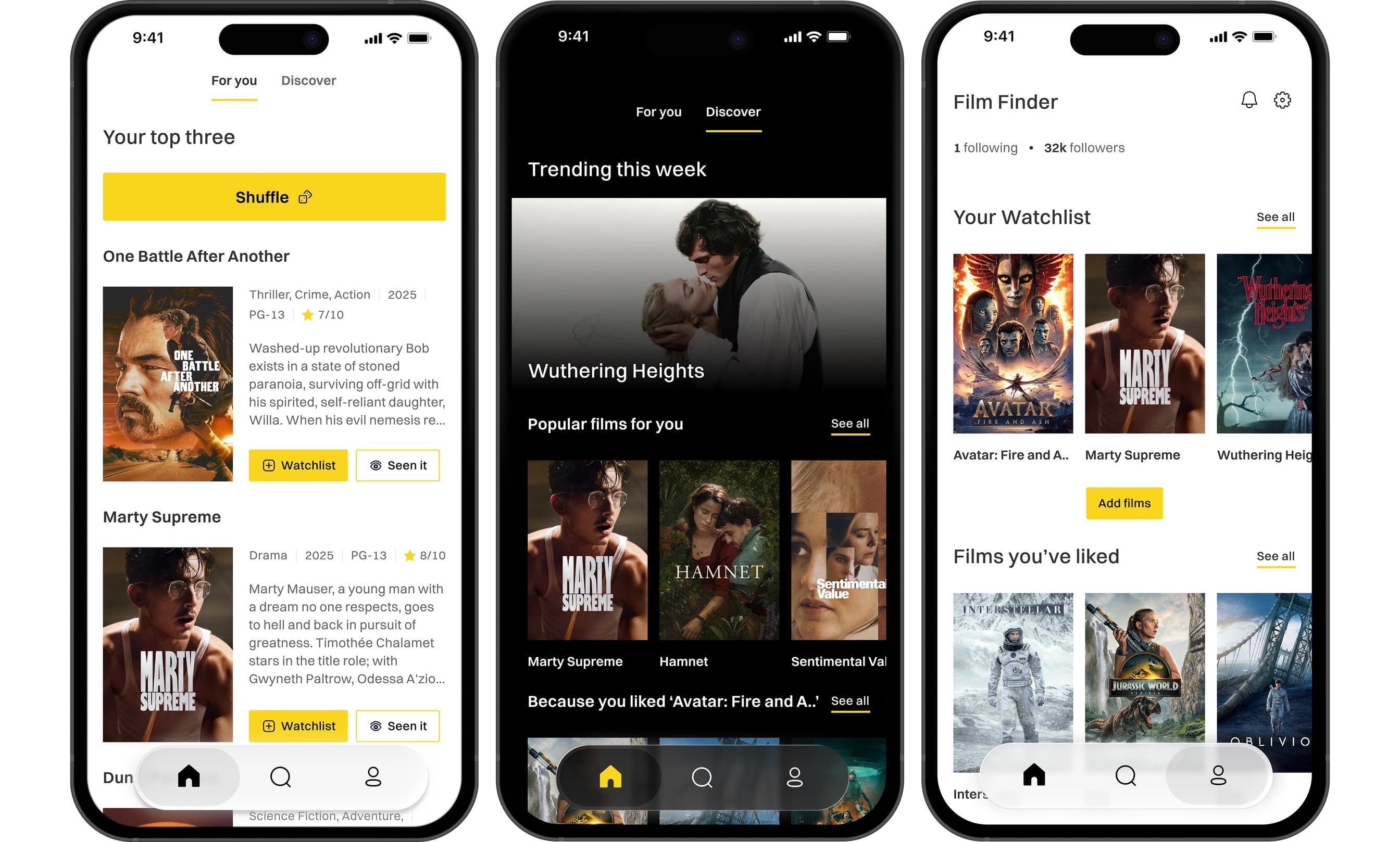
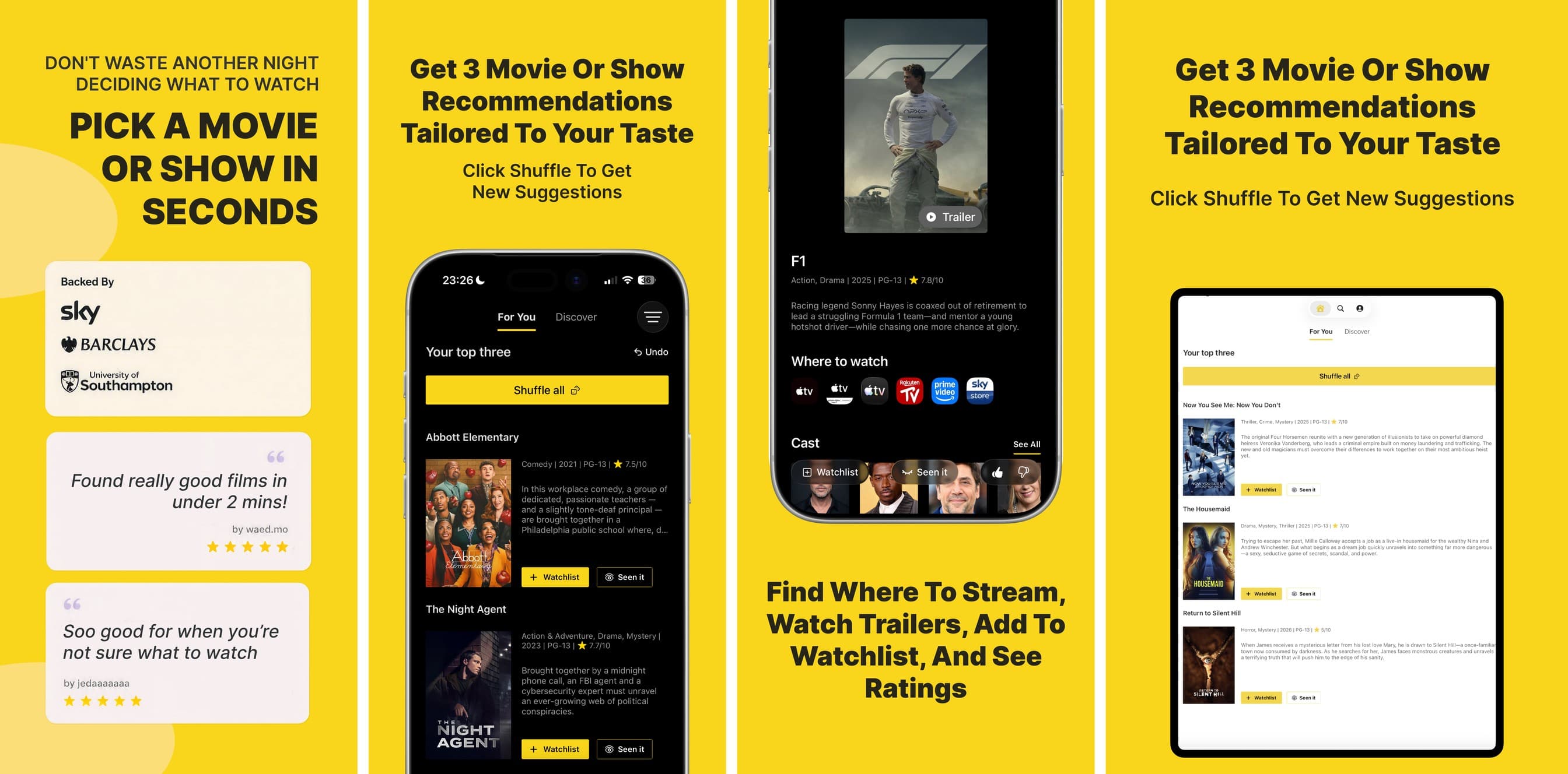
Top 3 is the brand idea made interface: reduce choice to raise confidence and speed up the decision.
On the App Store
The frames sit on brand yellow so the cinematic blacks of the device photography carry the journey. The assets communicate value instantly: speed and clarity, matching the core promise.
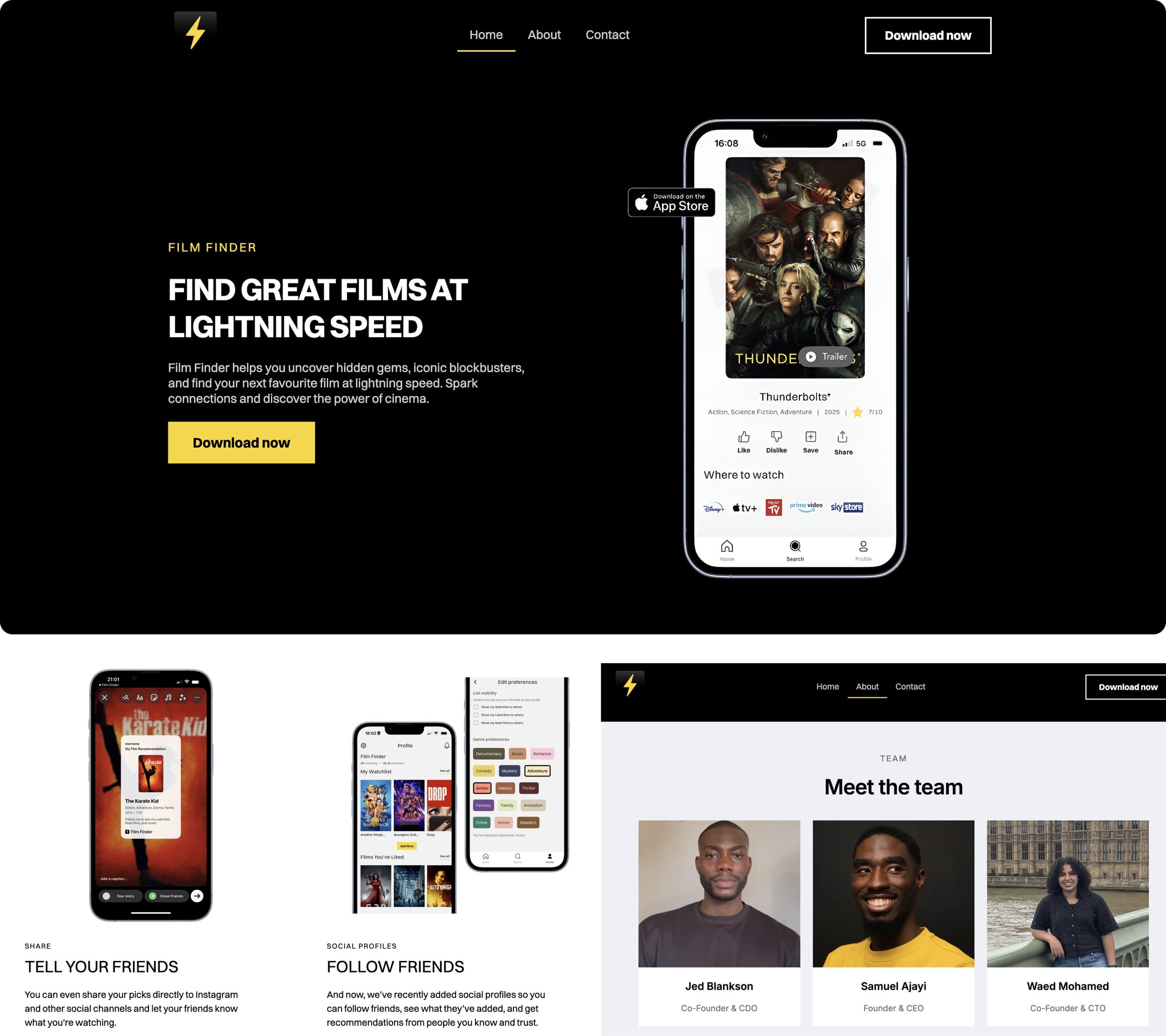
On the web
Where the app is loud, the site is confident. It leads with the tagline at scale, drops the bolt into the nav, and uses mockups as proof.
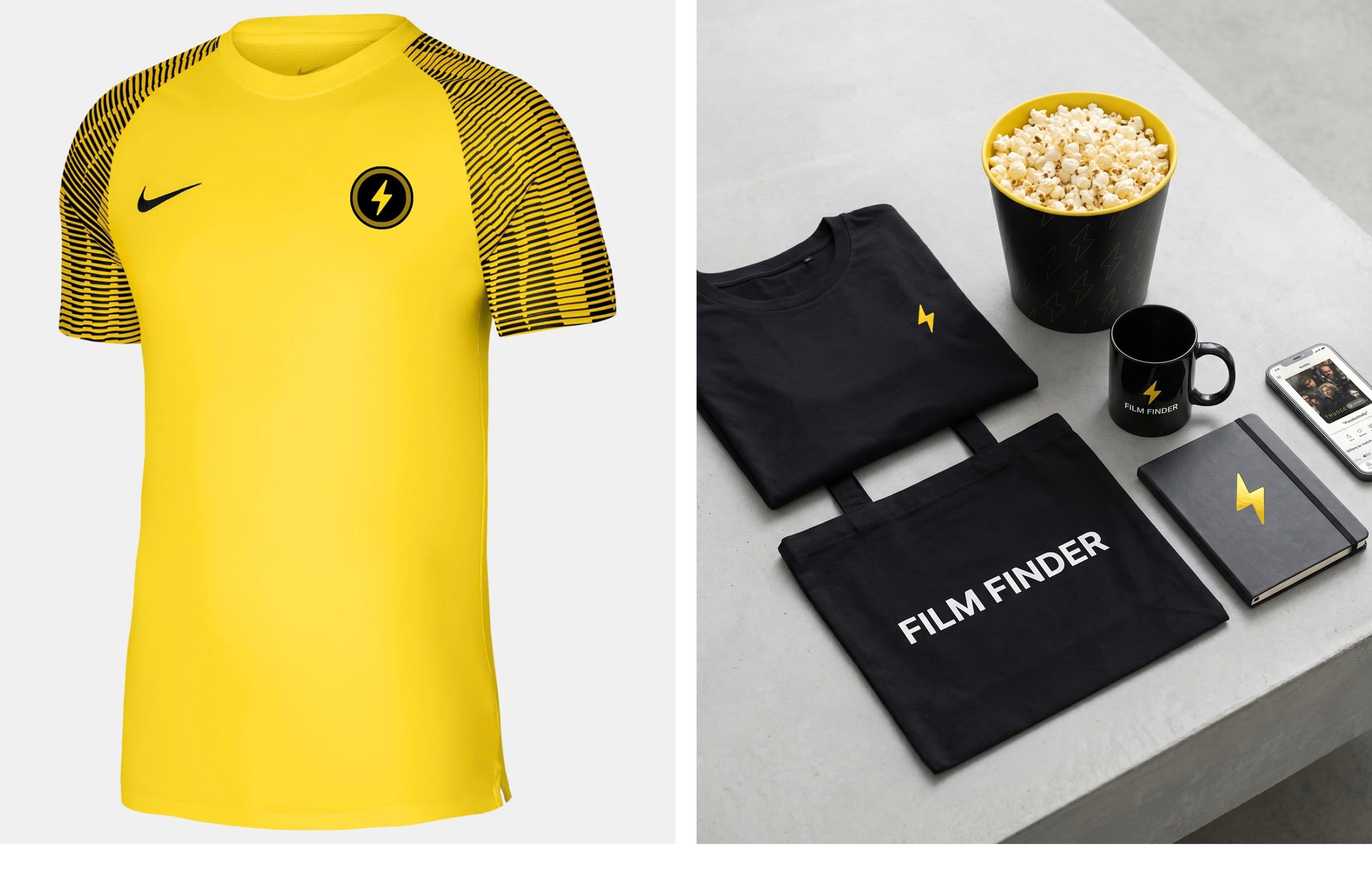
A shirt, to match the bag
The brand implies a community, so it had to live on real things. Some merch has shipped, some is in production, and every piece earns the same mark.
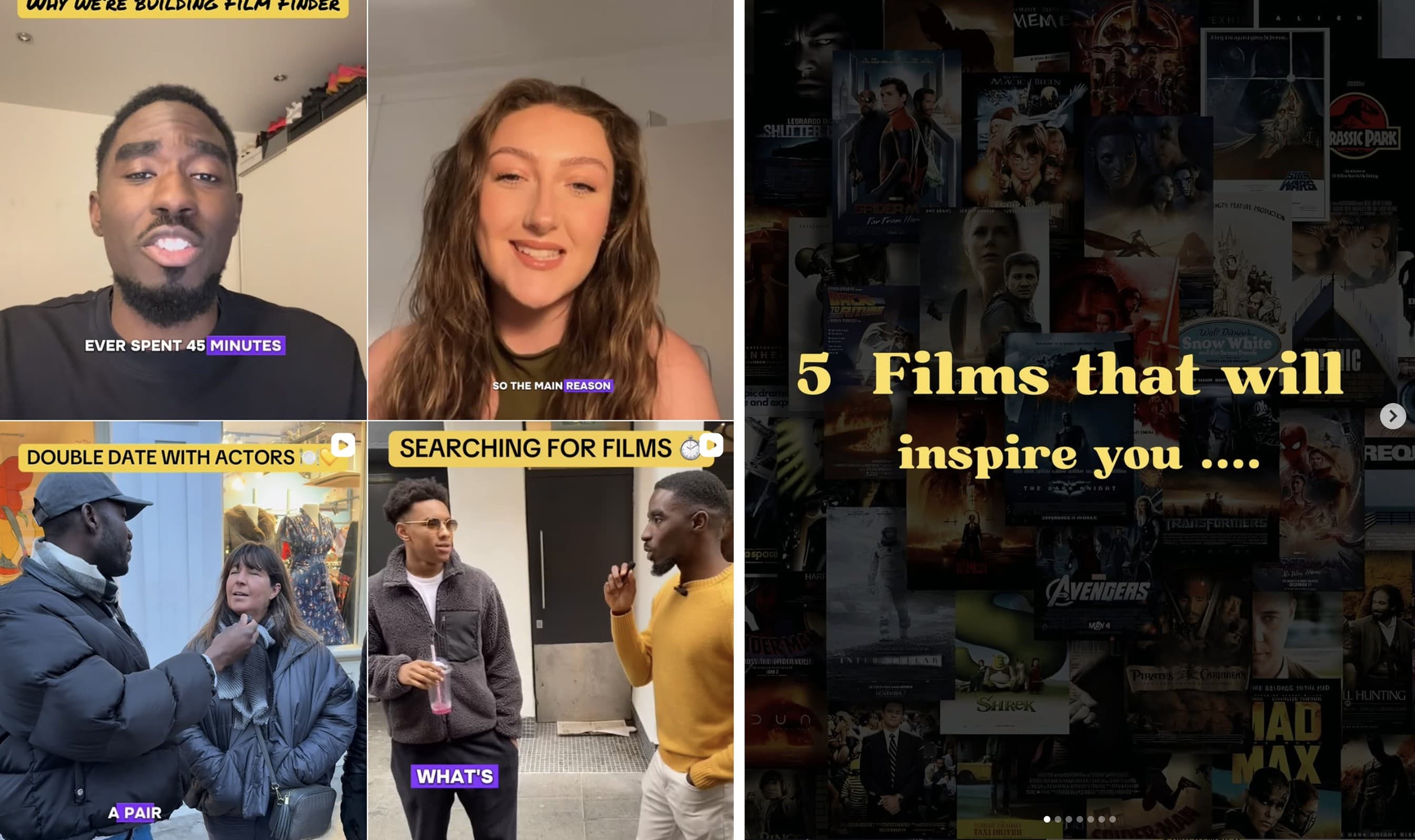
Social
The same brand and voice carried across our TikTok and Instagram, from explainers on why we built Film Finder to street interviews about how people actually pick films.
Built to grow: an expanded family of accents
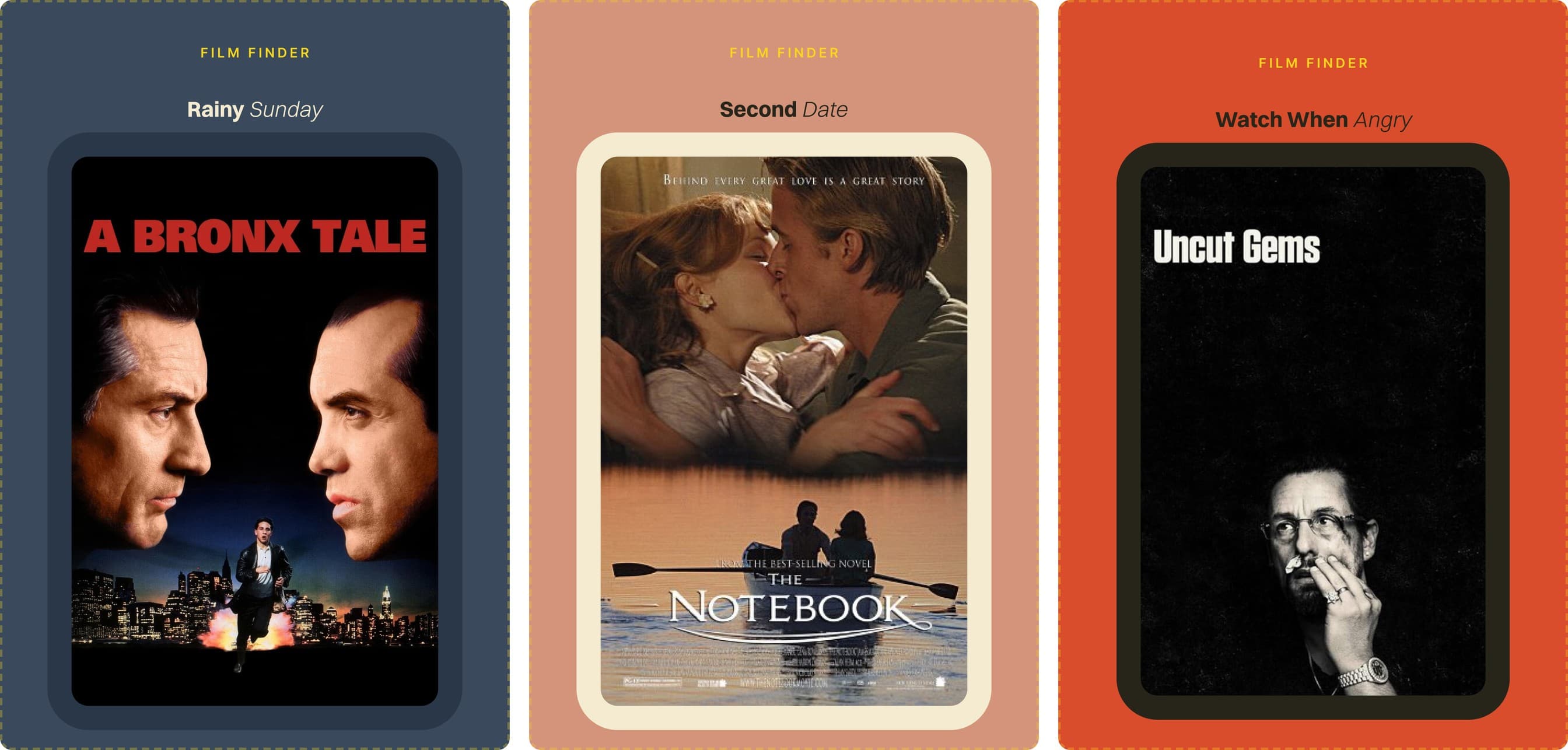
A monthly campaign concept. Three films, one mood, one poster set. Each edition gets its own accent colour so the system can breathe across the calendar without ever losing the yellow at brand level. A system that only describes today is a snapshot, this is how the brand grows without a rebrand.
The outcome
Film Finder now has one coherent identity that runs from a 1024px App Store icon down to a printed bolt on a shirt, and it is live on the App Store worldwide. The brand became part of how the product grew, from around 20 to 169 weekly active users after the redesign, with a 2,000 strong Substack and a 7,000 strong community across our socials and the monthly film club we run. It gives the product a recognisable point of view in a category that mostly looks the same.
Backed by
Film Finder has been supported by an accelerator, mentors and industry partners as we have grown.

Barclays
Funding through their accelerator programme
Sky
Leadership and mentorship

Everyman
Partner for our monthly film clubs

University of Southampton
Internship partnership
What I would do differently
My biggest takeaway: the brand was never the logo. It is the Shuffle dice, the empty states, the way we write a film description. The mark is maybe 1 percent of it. The rest is a hundred small decisions, and keeping those consistent is what made Film Finder feel like a brand rather than an app with a nice icon.